2022
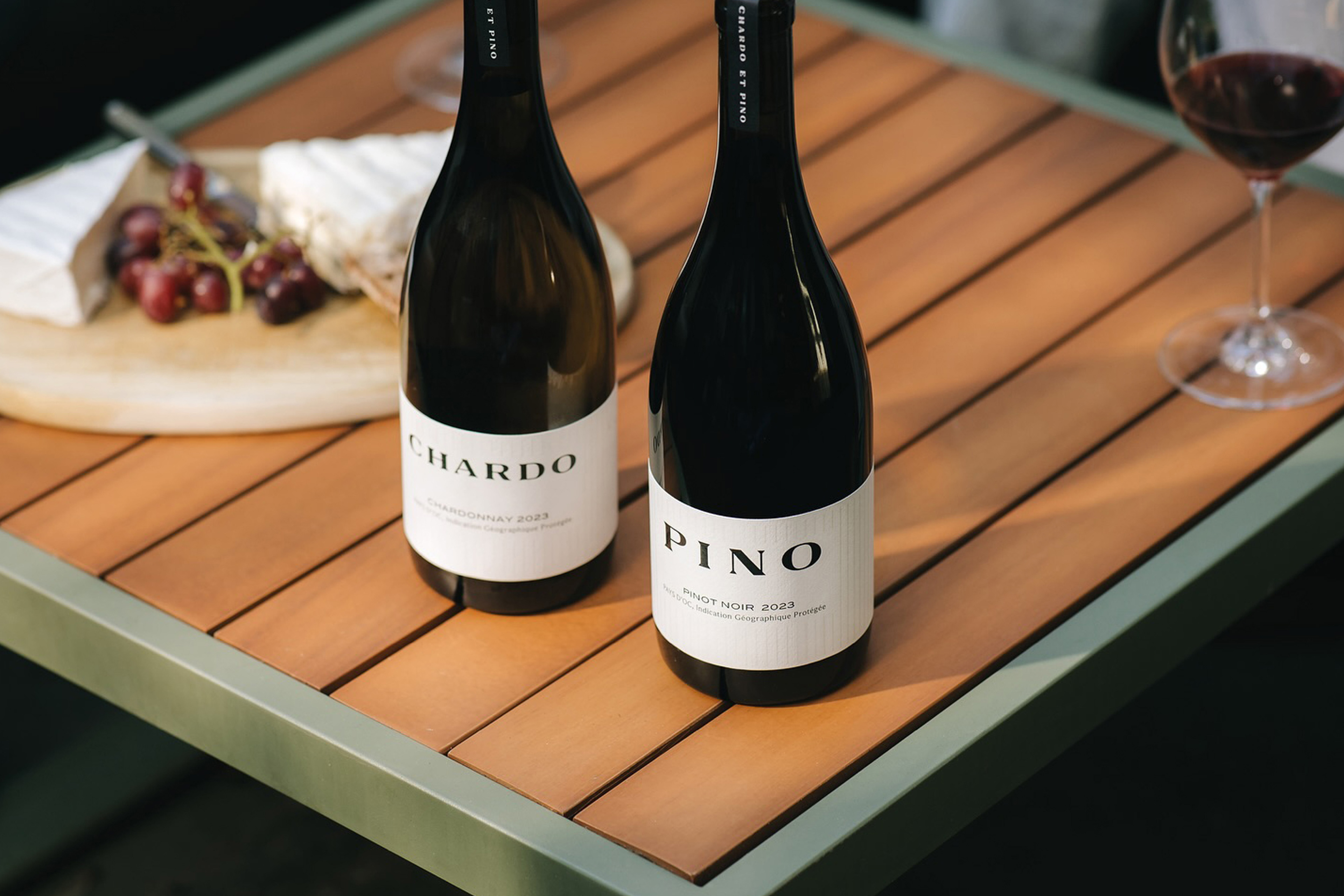
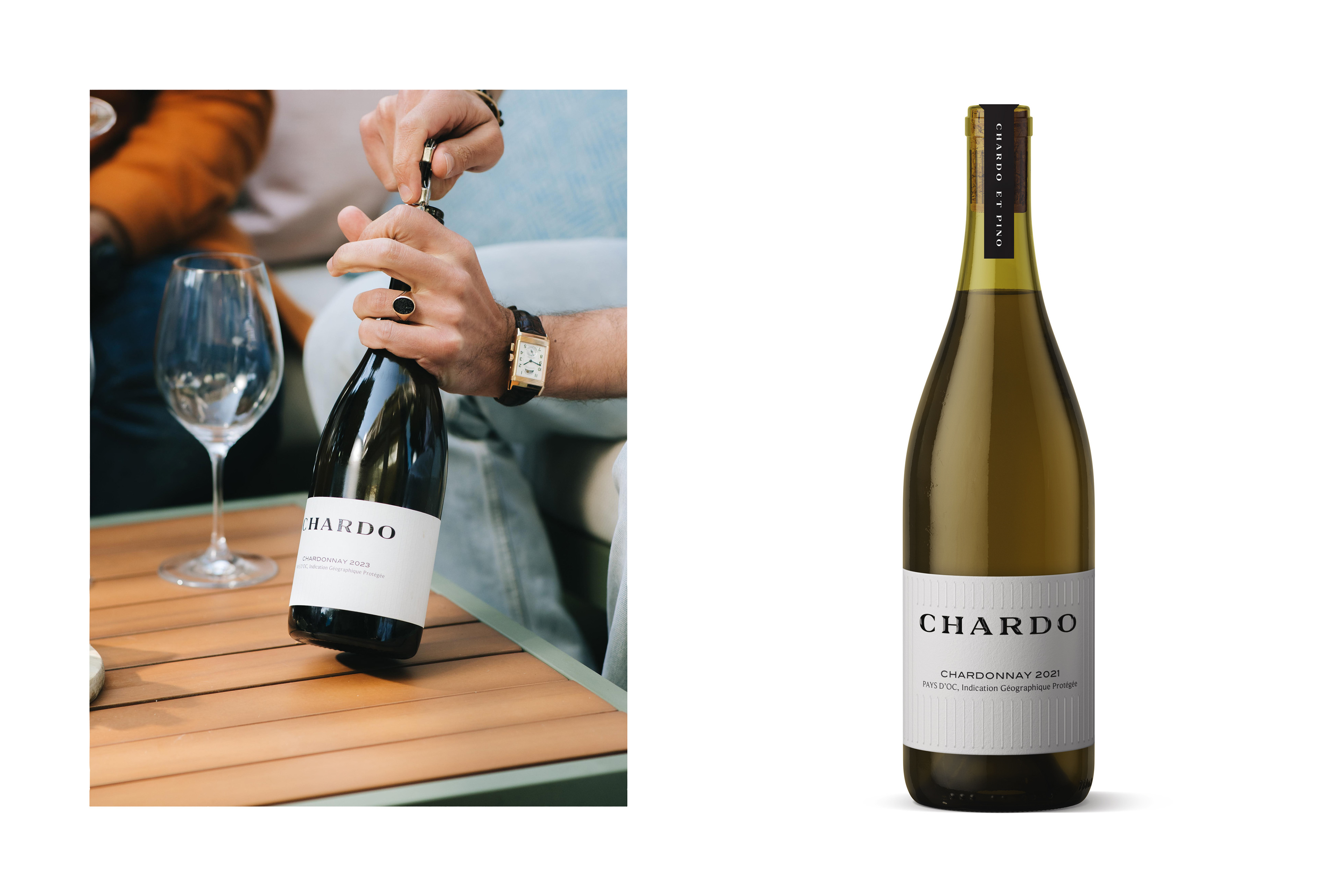
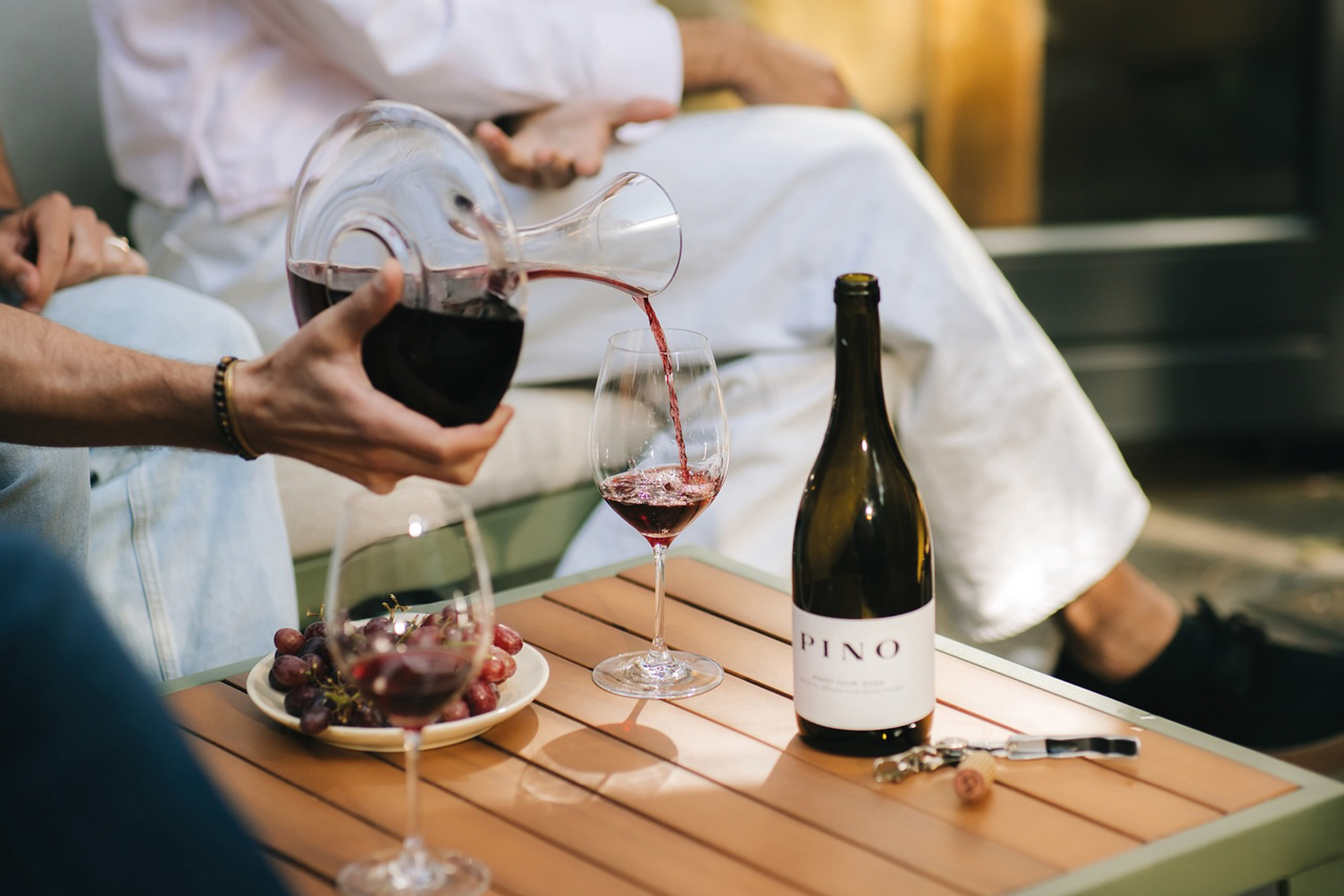
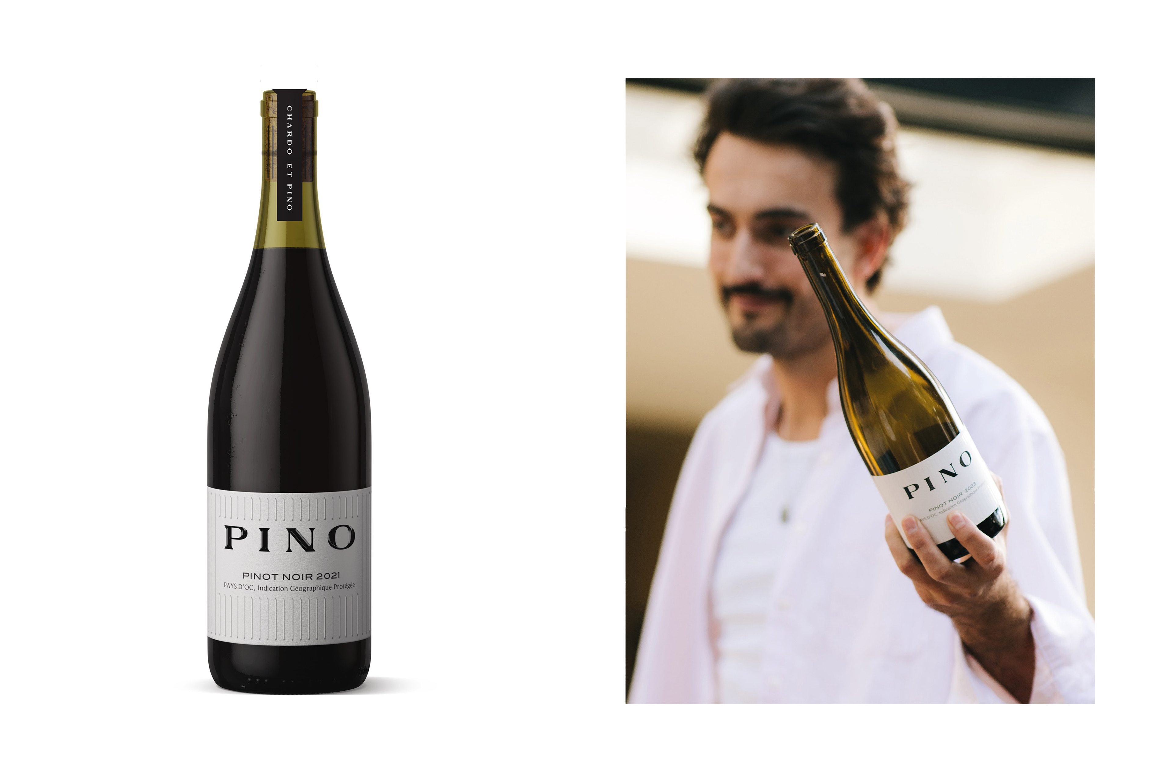
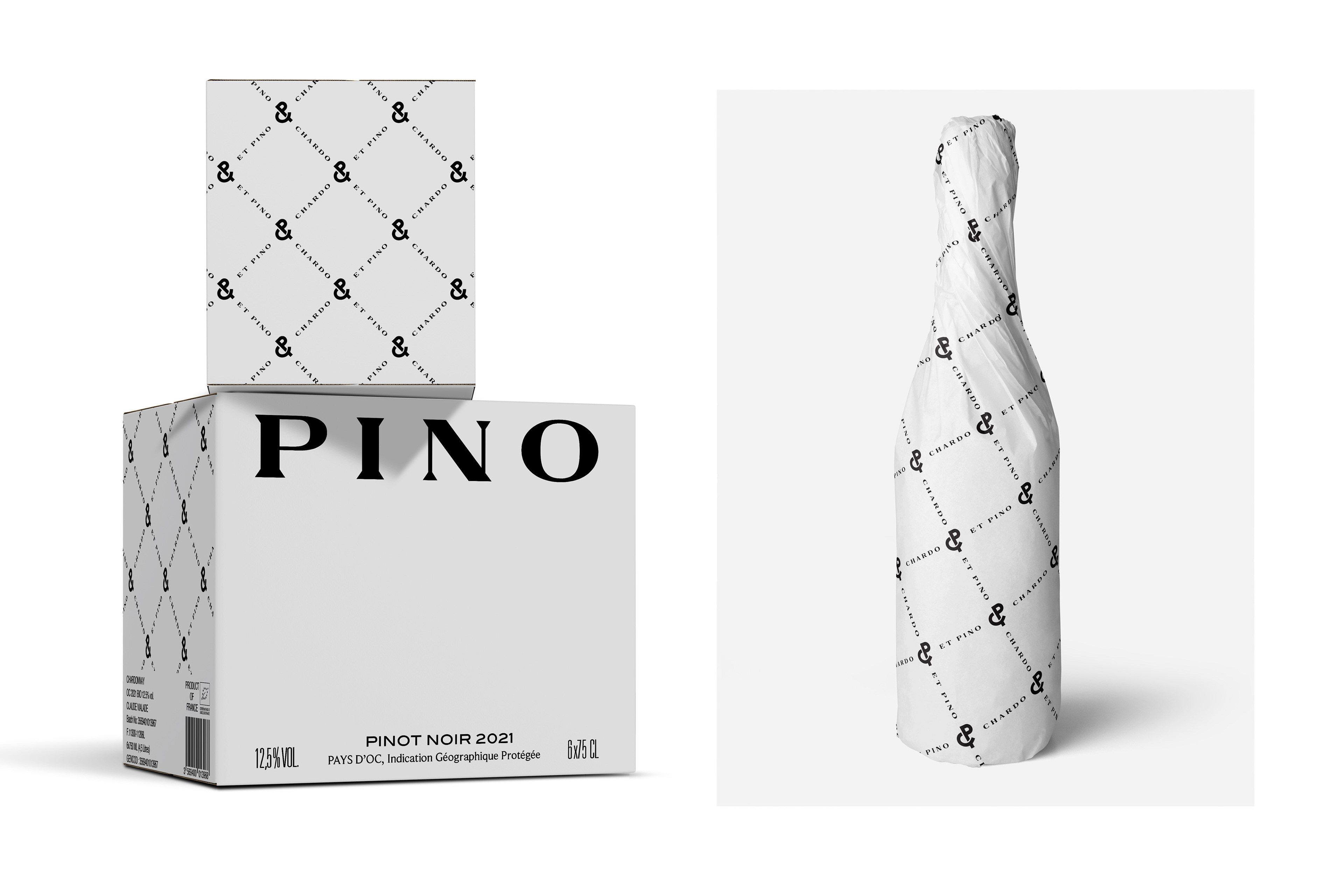
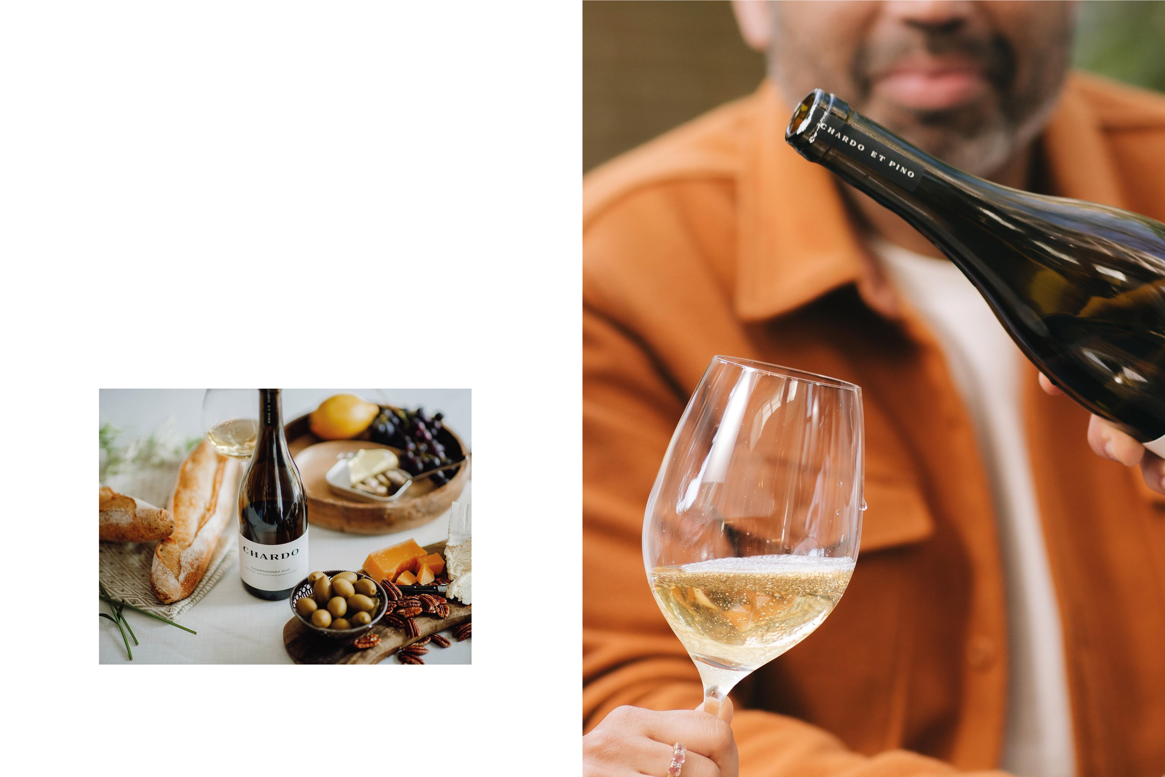
Brand identity and packaging for Chardo & Pino, two French wines from the Languedoc, grown on organic vineyards near Carcassonne and named after the nicknames for Chardonnay and Pinot Noir.
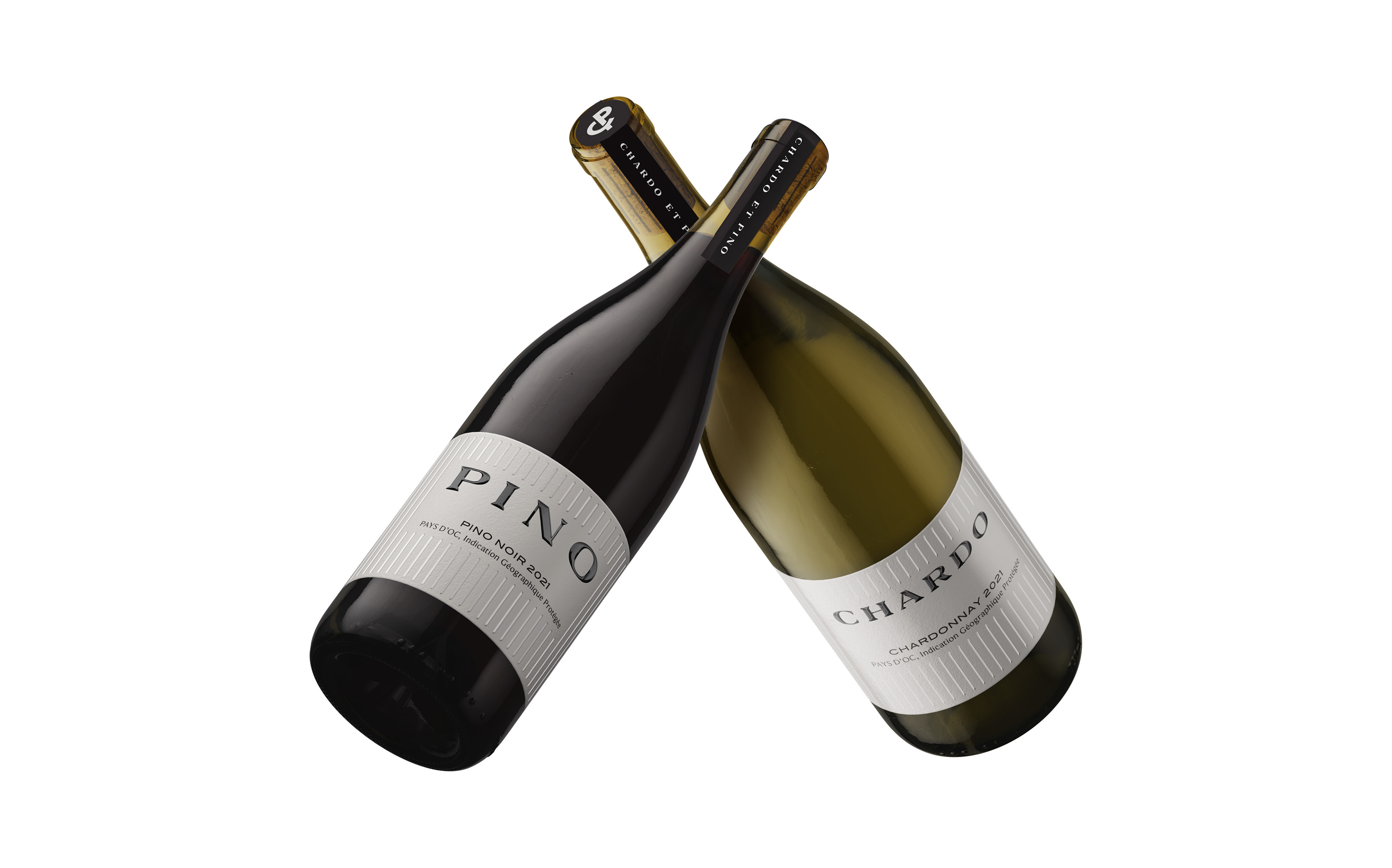
Borrowing its codes from couture rather than wine, the label design takes a metropolitan, gift-worthy approach. Black against white, matte against high gloss, embossing and lacquer on heavy paper give the bottles a tactile, boutique feel without raising their voice. The same minimal, considered style runs through the wordmark, the monogram on top of the bottle and the pattern on the box.
Photography: De Gouden Ton
Packaging Design Brand Identity Logo Design